Find out exactly how many covid cases there are where you live
By The Editor 18th Oct 2020


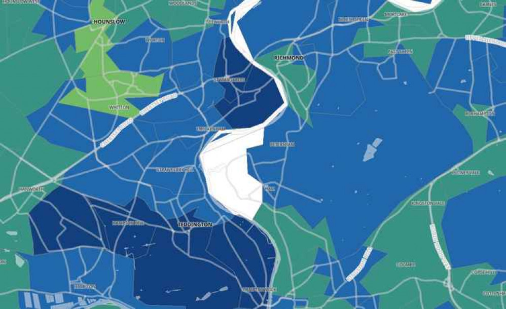
A new government interactive map has been launched to show residents how many coronavirus cases there are in their neighbourhood.
The map uses official data to show the extent of Covid-19 in every area of the country within the past seven days. It is updated with new figures every day.
It shows:
- the number of cases in the past seven days
- the rate of infection per 100,000 people in the population
- how the area compares to the rest of England
Each area, known as a Middle Super Output Area, has an average population of 7,200.
This is what the most up-to-date figures are showing, for the period October 6-12.
Coronavirus in Richmond
Richmond Central: 6 new cases in this period
Queen's Road: 11 casesRichmond Park, Sheen Gate and Petersham: 13
Tudor Drive: 8East Sheen North: 9
Kew Gardens: 13
St Margarets: 14Marble Hill: 18
As you can see from the dark colouring, these latter two areas have the highest local infection rates, at 209 and 244 new cases per 100,000 people respectively. Nearby Teddington is showing a similar rate.
Read more: Odds of vaccine in December reportedly '50-50'
The map is an upgrade on the ArcGIS model. The key to the ArcGIS map went up to 40 cases per 100,000 people.
This new gov.uk interactive map has a high reference point of 400 cases per 100,000 – an illustration of how the virus is spreading across the country.
Some areas (such as parts of Ham) show up as 'suppressed'. A spokesperson for Public Health England told Richmond Nub News that this means there are three or fewer cases in the area and the data is not shown for privacy reasons.
CHECK OUT OUR Jobs Section HERE!
richmond vacancies updated hourly!
Click here to see more: richmond jobs
Share:


